Mister Auto
Mister Auto is an application specializing in the online sale of car parts, catering to car enthusiasts and individuals who prefer maintaining their vehicles themselves instead of relying on a garage.
UX Design
UI Design
The context
Mister Auto aimed to improve the product search experience, which was sometimes too rigid or inconsistent, and to optimize the user experience.
The mission
Redesign the UX/UI of the one-page interface and its categories, based on analytics, to create a smoother user experience and helping users quickly find the car parts they need.
Persona
Mister Auto’s customers typically have a solid understanding of automotive mechanics. They visit the platform with a specific part or issue in mind, not for general browsing. However, as car enthusiasts, they remain open to discovering complementary upgrades or enhancements during their journey.
UX Audit
I conducted a UX audit of Mister Auto’s one-page interface using Bastien and Scapin’s ergonomic criteria, along with a user journey analysis.
Key findings include:
Excessive cognitive load
Lack of clear hierarchy
Irrelevant sections and options
The page structure was split into three main sections: Best Sellers, Main Categories, and Accessories & Cleaning.
Benchmark
Direct competitors such as AutoDoc and Oscaro also offer large catalogs but face similar UX issues: cluttered interfaces, too many categories, and a complex path to relevant parts. This leads to cognitive overload and user frustration, especially on mobile.
Despite having powerful product databases, these platforms often lack clear hierarchy and user-centric design. By streamlining navigation, adding contextual filters, and guiding users more effectively, Mister Auto could gain a strong competitive edge through a more intuitive experience.
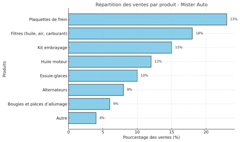
Analytics
Best Sellers Optimization : Analytics show that certain items in the “Best Sellers” section do not perform well compared to the top-selling products. These items should be reconsidered to avoid overloading the section unnecessarily.
Promotions section : The “Don’t Miss Out” promotions section is popular and should gain better accessibility to improve its visibility and usability for all users.
Card Sorting
To improve navigation, reduce the cognitive load of the main categories, and enhance the hierarchy of information, we conducted a card sorting exercise led by a UX Researcher.
The process involved diagrams, similarity matrices, and cluster groupings based on users’ mental models.
Solution
Based on UX research, including analytics and card sorting, I proposed a new interface structure aligned with user intent and navigation patterns. The redesigned layout offers clearer entry points, improved content hierarchy, and progressive filtering to reduce cognitive load and streamline the search experience.
Based on UX research, including analytics and card sorting, I proposed a new interface structure aligned with user intent and navigation patterns. The redesigned layout offers clearer entry points, improved content hierarchy, and progressive filtering to reduce cognitive load and streamline the search experience.
Top Section and navbar
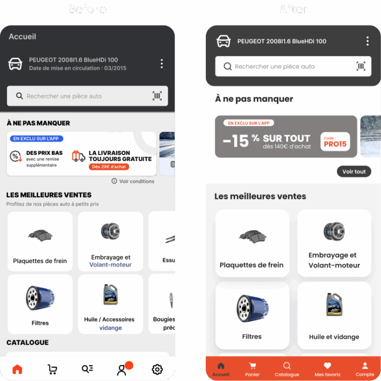
Header Optimization : Reduced the header size to improve space and visibility. Removed non-essential elements such as the “Vehicle Registration Date” and “Home” button, which is already accessible via the navbar.
Promotions Accessibility : Enabled users to view the full promotions section with a “View All” button, moving away from a carousel-only format to enhance accessibility.
Improved Navbar Visibility : Added labels for icons to make the navbar more accessible and user-friendly.
Navbar Rearrangement : Reorganized navbar elements, including the addition of a “Favorites” section and merging “Settings” directly into “Account” for better efficiency.
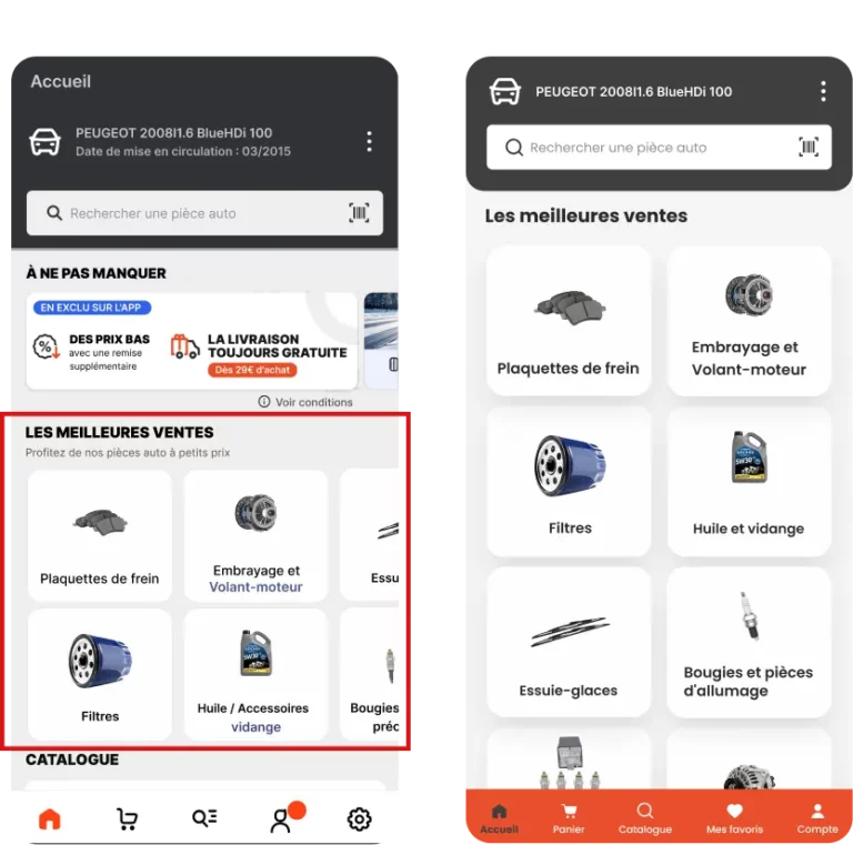
Best sellers
Analytics-Based Optimization : Reduced the section from 16 to the top 8 most-sold items, ensuring all displayed products are relevant and justified by analytics.
Cognitive Load Reduction : Limited the number of items to 8, aligning with the user’s cognitive capacity as per Miller’s Law, which suggests handling 7±2 elements effectively.
Visual Simplification : Replaced the carousel with a layout where all items are directly visible from the main page, improving clarity and reducing navigation effort.
Enhanced Accessibility : The new layout allows users to view all items at once, making the section more accessible and user-friendly.
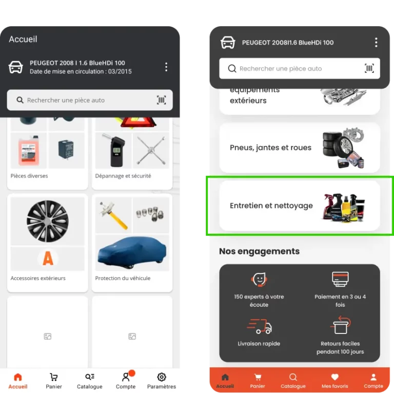
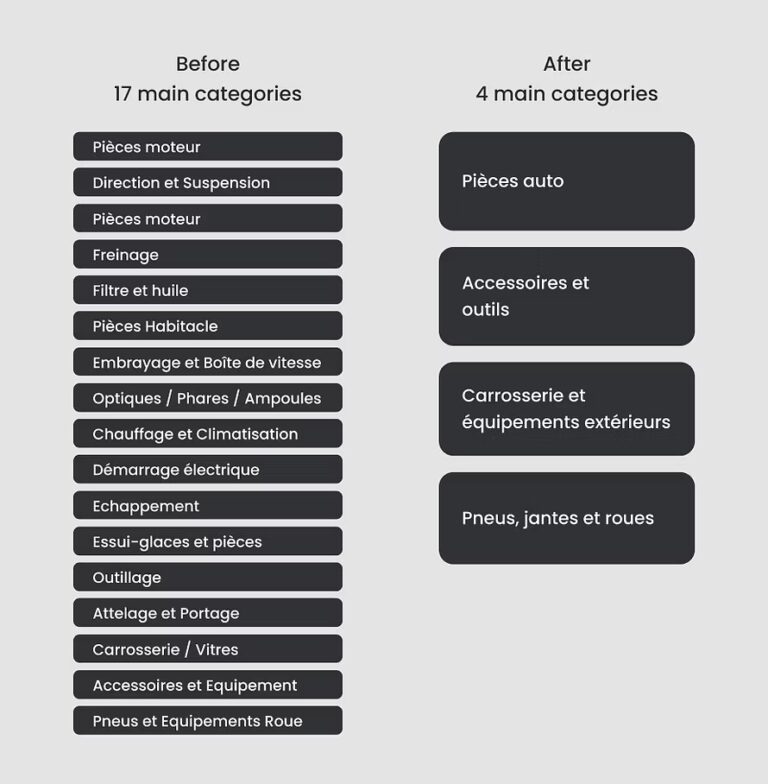
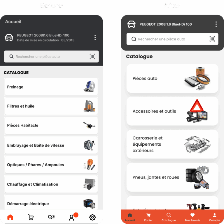
Main categories
Category Reduction : Reduced the number of main categories from 18 to 5 using card sorting, significantly decreasing users’ cognitive load and aligning with Miller’s Law to respect users’ cognitive capacity.
Segmented Navigation : Introduced broad, general categories that encompass subcategories, allowing users to navigate step-by-step through logical groupings(principle of Chunking).
Breadcrumb Navigation : Added a breadcrumb trail to simplify navigation within subcategories and provide clear contextual hierarchy for users.
Accessories and cleaning
Category Reduction : Reduced the number of main categories from 18 to 5 using card sorting, significantly decreasing users’ cognitive load and aligning with Miller’s Law to respect users’ cognitive capacity.
Segmented Navigation : Introduced broad, general categories that encompass subcategories, allowing users to navigate step-by-step through logical groupings(principle of Chunking).
Breadcrumb Navigation : Added a breadcrumb trail to simplify navigation within subcategories and provide clear contextual hierarchy for users.