Les Handikapables
Les Handikapables is a nonprofit initiative that empowers people with disabilities by making their rights and available support easier to understand and access.
UX Research
UX Design
UI Design
The context
People with disabilities still face many barriers when it comes to understanding and accessing the support they’re entitled to. Administrative and digital systems often fail to consider diverse user needs, making inclusion uncertain.
The mission
The goal was to design an inclusive platform that helps people with disabilities understand their rights and access available support more easily. The focus was on clarity, accessibility, and autonomy.
UX Research
After the kick-off meeting, we clarified the goals and defined the expected outcomes with the client. My role was to understand the real needs and challenges faced by people with disabilities when searching for information about their rights.
My assumptions
I assumed that separating legal rights from well-being content would make information easier to process. Social activities like art therapy or group sessions likely play a key role in users’ well-being and deserve dedicated space.
I also expected that support resources would be fragmented and that poor web accessibility could discourage users. Finally, I anticipated that complex language would be a barrier, making Easy-to-Read formats (FALC) essential for inclusion.
Interviews
I interviewed seven people with various disabilities (motor, cognitive, visual), mostly aged between 40 and 50, along with three younger individuals aged 20 to 30. A user journey on the PHARE website was also observed to enrich the analysis.
The interviews explored how users look for help, the barriers they face, and their emotional reactions throughout the process.
Affinity Diagram
Using an Affinity Diagram, I synthesized the interviews by creating “atoms” from key notes, grouping them by similarity, and rephrasing insights to extract the main ideas.
I observed a clear gap between my initial assumptions and the actual issues faced by people with disabilities when seeking information to improve their well-being.
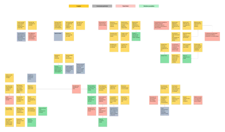
Key Insights
Based on user interviews and usability tests, I extracted atomic insights and grouped them into thematic clusters. This synthesis revealed clear patterns in user needs, frustrations, and expectations, which guided the design direction and improved the platform’s accessibility and usability.
People with disabilities do not separate their legal rights from their well-being, as respect for their rights directly impacts their personal dignity and quality of life.
They need contextual information to understand what rights they are entitled to.
Disability support organizations and resources are overly fragmented and dispersed.
People with disabilities want autonomy and independence to reduce reliance on others.
Those with motor or visual impairments need the ability to complete forms and documents independently, currently impossible on the PHARE platform due to print-only forms.
Precise labeling of website elements is essential to avoid constant issues for visually impaired users.
People with disabilities feel the need to no longer be infantilized by others.
Some may refuse help or a diagnosis out of a sense of pride.
Services are difficult to reach by phone, appointments are long, and email responses are sporadic due to overburdened services.
Easy-to-Read (FALC) content should be used sparingly to avoid affecting credibility.
Users searching for their rights online need fewer, broader categories that encompass more information, reducing the risk of mistakes and frustration.
Informational texts should be simplified and concise to avoid cognitive overload, with key points highlighted and summaries provided to ensure users don’t miss important information.
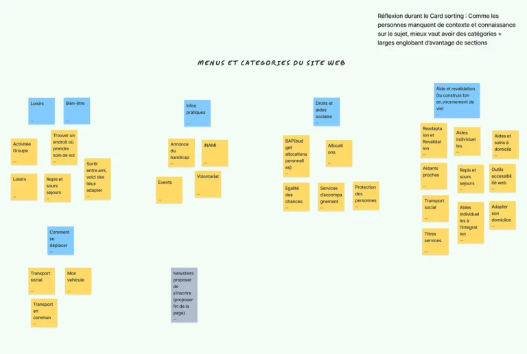
Card sorting & Benchmark
I conducted a UX audit of the PHARE website, along with several user tests. This platform aims to inform users about their rights and improve their well-being.
Using the PHARE website as a base, I performed a Delphi card sorting exercise to design the information architecture. Through this process, we streamlined the categories from 10 to 5, which clarified the information hierarchy.
While the site meets official accessibility standards, many usability issues remain, highlighting the need for a holistic approach to web accessibility.
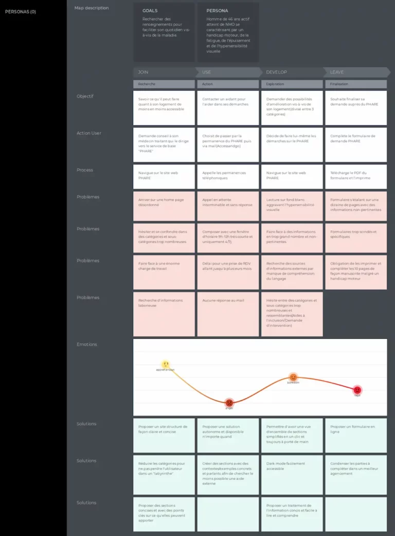
User Journey
I created a User Journey Map based on insights from interviews and user testing. This allowed me to bring the insights and the PHARE benchmark to life in a real scenario with users.
The User Journey Map highlighted friction points and their solutions at each step of the user journey, providing a clear view of the challenges to overcome and areas for improvement.
The main friction poin identified are :
ineffective and complex, with unacceptable wait times often exceeding legal standards and limited availability of support.
Aid application process: lengthy, irrelevant, and fragmented forms with no accessible or interdependent structure, and a handwritten requirement despite motor disabilities.
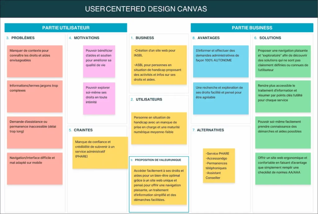
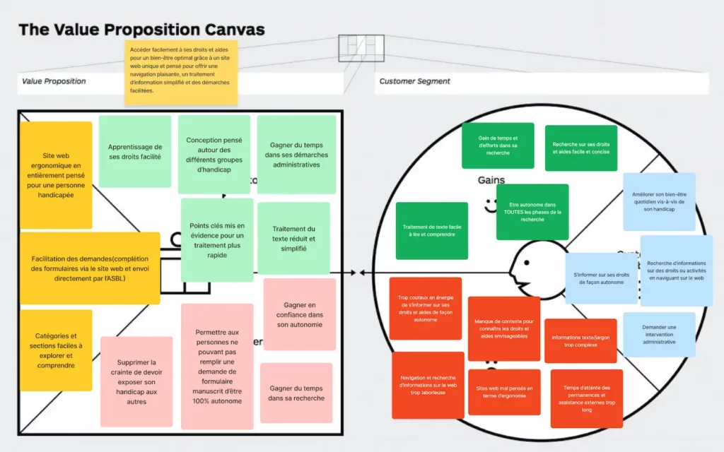
UNIC Canvas & Value proposition
The UNIC Canvas allowed me to gather and structure key information about users, objectives, and the direction for future features. This tool also facilitated collaboration by providing a clear, comprehensive view of the project to the organization’s leaders.
The Value Proposition complements the UNIC Canvas. While it might seem repetitive, the Value Proposition focuses more on the tangible aspects of the product and the ideas to be implemented.
It clarifies the elements that will meet user expectations and distinguish this product from competitors.
UX Design
I translated the research findings into wireframes to define the platform’s structure and user flows. Content was reorganized into clear sections, separating rights, support, and well-being, to reduce cognitive load. I focused on simplifying navigation and prioritizing key information to make the experience more accessible, especially for users with cognitive or motor impairments.
Accessibility
The website was built with clean, structured code to ensure compatibility with assistive tools like AccessiWay. Designed following WCAG standards, it offers a high level of accessibility and comes close to AAA compliance.
Ton of Voice
To avoid the common feeling of being infantilized, I designed a respectful and inclusive visual identity, including mature-style illustrations and a modern logo. I also defined a tone of voice that is clear, friendly, and avoids overly playful or authoritarian language.
Awarness
I chose the “Luciole” font, designed for people with visual impairments and dyslexia. While experts agree that no font is universally accessible, many users I interviewed lacked the digital skills to adjust settings, making default readability especially important.
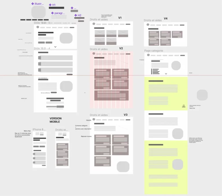
Wireframes
I am now in the design phase, where I translate all my research and insights into a wireframe. I am defining the basic structure of the website, taking into account user needs and project goals. In creating these wireframes, I :
Visualize the information architecture
Test and refine the layout of elements
Ensure intuitive navigation
Identify potential friction points
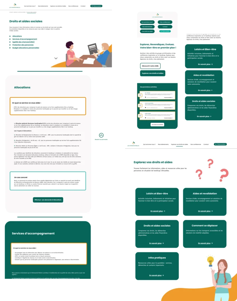
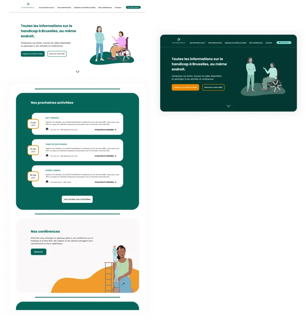
Home page
The homepage delivers a clear and direct value proposition, with CTAs for the organization and to explore available rights and assistance online. Navigation is simplified with five main menus to reduce cognitive load.
Key elements of the homepage include :
A call-to-action to explore one’s rights.
A dark mode, directly accessible for users with visual hypersensitivity.
Highlighting the organization’s activities prominently. plan.
Categories & Forms
The site sections are presented in a straightforward way, each with a brief description to provide a clear overview, no more maze-like navigation as with the PHARE service.
All subsections are accessible directly from a table of contents.
An anchored, sticky button allows users to easily return to the table of contents without excessive scrolling, supporting exploratory navigation.
Sections are color-coded to aid navigation for users with dyslexia and other cognitive challenges.
Each section includes concise text with a “What This Service Can Offer You” block at the top, followed by a concrete example and a summary of key points.
We make PHARE forms accessible directly on our website or via ITSME, removing the need to print and handwrite them—a process often difficult for people with motor or visual disabilities.
Submissions are handled digitally, then printed and sent by our organization to the authorities, ensuring full data confidentiality.
Key accessibility features include:
Single-column layout for readability
Error indicators using both color and symbols
Error summary for quick review
This digitalization empowers all users, including people with disabilities, to complete forms independently.
Categories & Forms
The site sections are presented in a straightforward way, each with a brief description to provide a clear overview, no more maze-like navigation as with the PHARE service.
All subsections are accessible directly from a table of contents.
An anchored, sticky button allows users to easily return to the table of contents without excessive scrolling, supporting exploratory navigation.
Sections are color-coded to aid navigation for users with dyslexia and other cognitive challenges.
Each section includes concise text with a “What This Service Can Offer You” block at the top, followed by a concrete example and a summary of key points.
Forms are submitted digitally, then printed and sent by us with full confidentiality.
Accessibility features:
Single-column layout
Color + symbol error indicators
Error summary
Enabling everyone, including people with disabilities, to complete forms independently.