Luxembourg National Data Service
The Luxembourg National Data Service (LNDS) is a public initiative aimed at facilitating secure and ethical access to data across institutions, while empowering citizens to manage their personal information.
UX Research
UX Design
UI Design
The context
The LNDS project helps Luxembourg residents understand and manage how their personal data is used. It promotes clarity, control, and trust around secondary data usage.
The mission
Design a digital portal that makes secondary data more accessible and transparent, empowering citizens to control how their information is shared.
UX Research
In this project, my UX Research role involved understanding both the project’s goals and the broader challenges faced by Luxembourg residents regarding personal data management.
This process helped define clear user needs and informed design decisions focused on clarity, trust, and accessibility.
Desk Research
I began the project by researching the concept of secondary data to better understand the ecosystem, regulations, and challenges it poses for citizens. Through desk research, I explored existing studies on data privacy, transparency, and digital trust.
In parallel, I received qualitative insights from previous interviews conducted by LNDS and complemented this with three user interviews
Interviews
8 out of 12 users felt overwhelmed by the amount of secondary data shared about them. Most had little understanding of the topic and tended to avoid it altogether, a clear sign of the “ostrich effect.”
Nearly half didn’t want to manage their data, and some preferred not to see it at all due to the discomfort it caused.
Introducing primary data, which is even more sensitive and identifiable, would have increased confusion and anxiety. Based on these insights, I ruled out that option in the design.
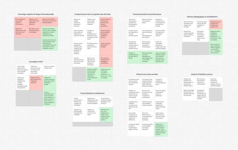
Affinity mapping
Beyond individual responses, I grouped insights to reveal key patterns. Users clearly valued clarity over control, they didn’t want advanced settings, just a simple understanding of what’s happening.
Most were unfamiliar with pseudonymization, which made it harder to trust how their data was managed.
Faced with a complex and opaque system, users adopted a passive stance — not out of indifference, but due to a lack of clear, accessible information.
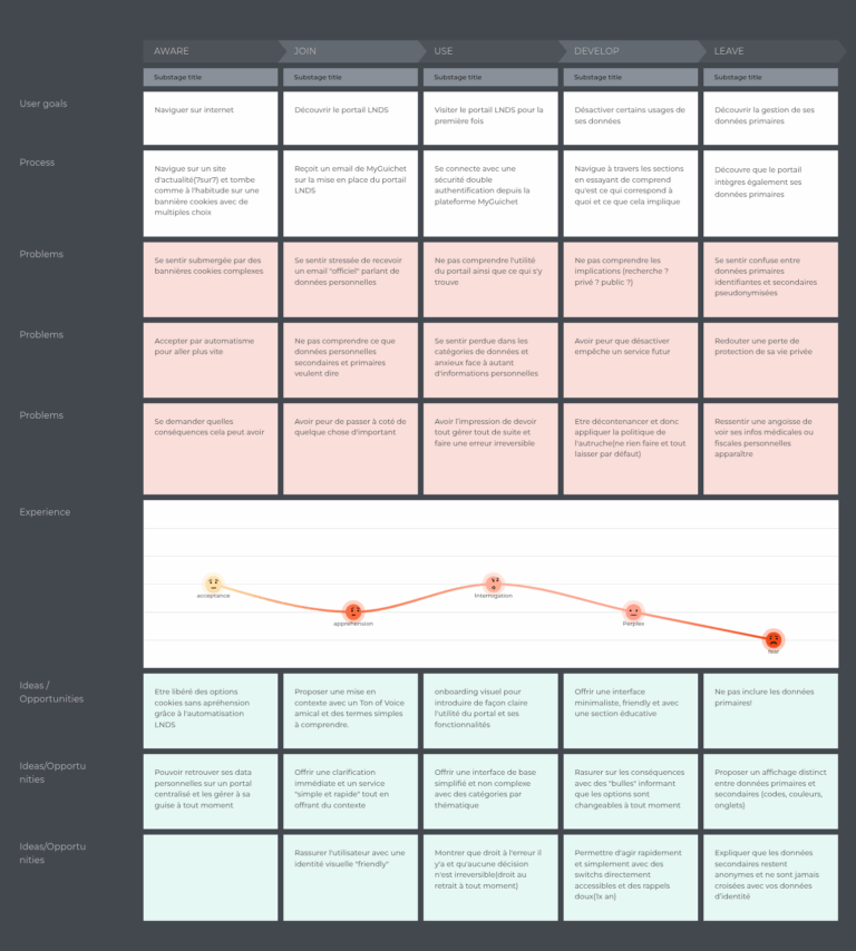
User Journey
I mapped the user journey from discovery to data management, based on insights from user interviews. This revealed emotional drops caused by confusion, overload, and lack of trust.
Main pain points :
-
Stress from complex terminology and official tone
-
Confusing first-time experience due to poor onboarding
-
Fear of making mistakes without clear feedback
-
Difficulty distinguishing primary vs secondary data
-
Low engagement caused by unclear expectations
These findings informed UX decisions such as: simplified language, contextual help, progressive onboarding, and clearer data categorization.
UX Design
Based on the Research phase, I designed an interface that feels clear, intuitive, and reassuring. The goal was to guide users step by step, reduce cognitive load, and support confident decision-making, even for those with limited digital skills.
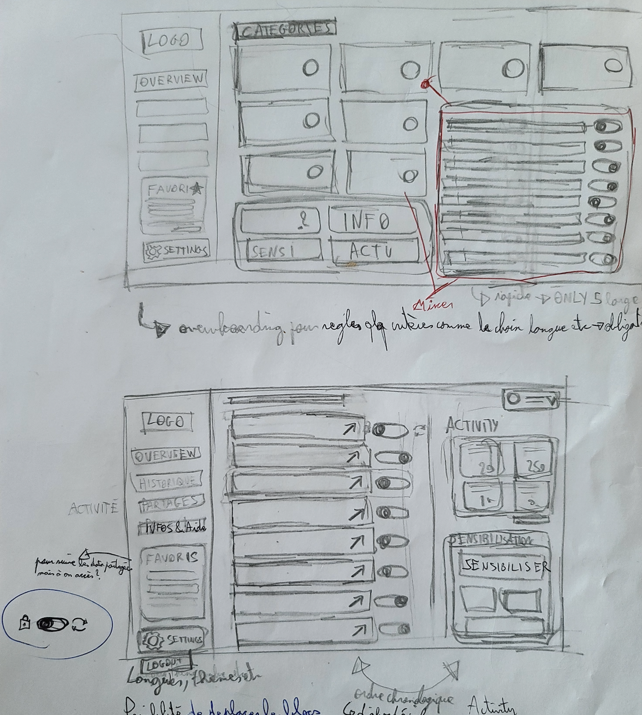
Wireframes
I am now in the design phase, where I translate all my research and insights into a wireframe.
I am defining the basic structure of the website, taking into account user needs and project goals. In creating these wireframes, I :
Visualize the information architecture
Test and refine the layout of elements
Ensure intuitive navigation
Identify potential friction points
Accessibility
The platform meets WCAG 2.1 standards and supports assistive technologies with clear text, strong contrast, and keyboard navigation. A profile switcher allows guardians to manage data for dependents with ease.
UI Design
A clear, friendly interface with intuitive controls helps users shift from avoidance to confident action. Guided onboarding and accessible language ensure a reassuring, professional experience.
Awarness
The platform helps users understand and manage their secondary data with clear options and educational guidance. Key features like Sharing and History support GDPR rights to review, modify, or withdraw consent anytime.
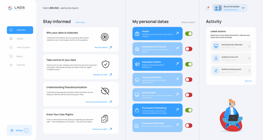
The Overview
Access is secured via MyGuichet.lu with two-factor authentication. A short onboarding guides users through key features like data controls and customizable content blocks.
The interface is structured into five clear sections, combining clarity, consistency, and a reassuring visual tone. It’s designed to minimize cognitive load and help users stay in control.
An Awareness section explains secondary data and user rights in simple, accessible terms. In Sharing, users manage data via intuitive toggles; while the Activity feed keeps them informed in real time.
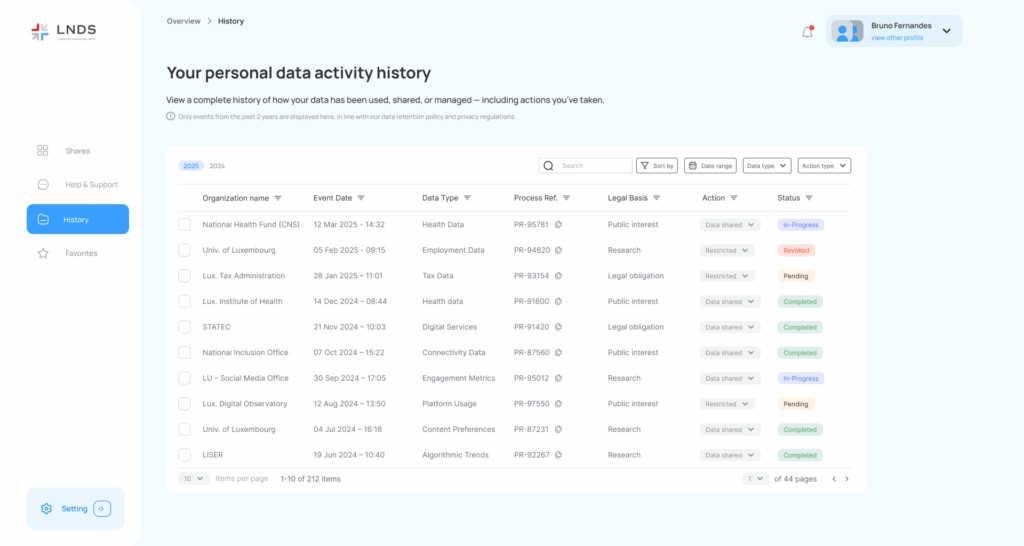
History page
The History page offers a clear and user-friendly view of data-sharing activity over the past two years. It helps users understand and manage their history without feeling overwhelmed.
To meet legal requirements, users can modify or revoke consent at any time via an Action column—no need to dig through menus. Each entry is labeled with a status tag (Ongoing, Pending, Completed, or Revoked) for quick understanding.
Filters by year, type, status, date, and actions make navigation simple. The page is designed to give users full clarity and control in just a few clicks.