Proximus
“Proximus is the leading telecommunications company in Belgium, offering internet, TV, mobile, and digital services to millions of users nationwide.
UX Research
UX Design
Accessibility
The context
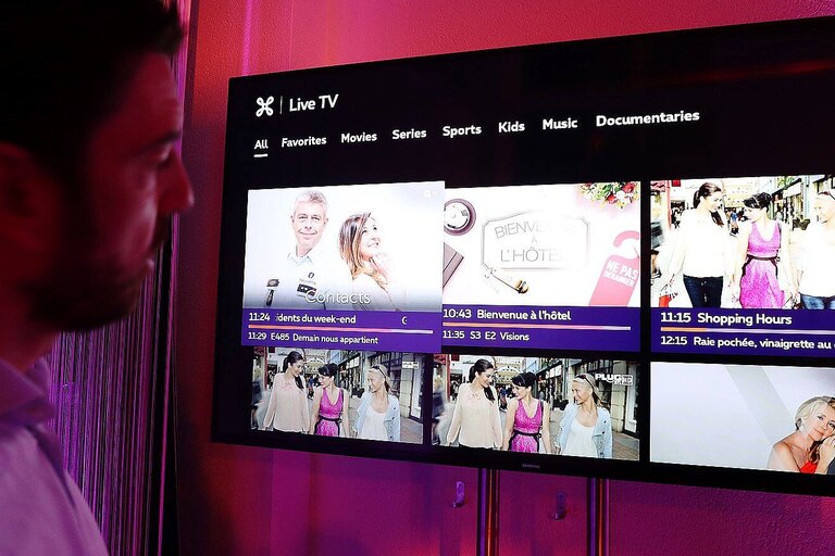
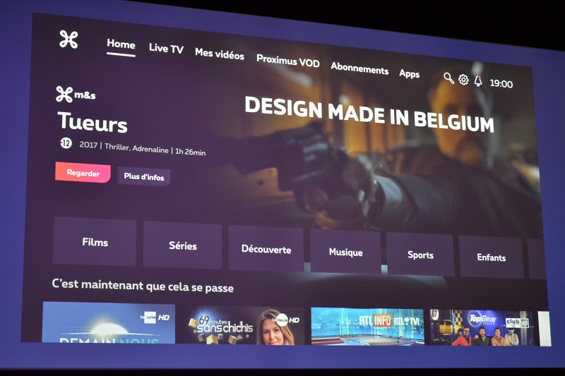
Proximus' TV platforms, including the TV Box, mobile app, and website, aimed to improve their digital accessibility, particularly on TV interfaces.
The mission
Identify the barriers faced by the target users, detect gaps in the current accessible content offering, and propose concrete, technically feasible solutions aligned with accessibility standards.
UX Research
In this project, my UX Research role involved understanding both the project’s goals and the broader challenges faced by Luxembourg residents regarding personal data management.
This process helped define clear user needs and informed design decisions focused on clarity, trust, and accessibility.
Discovery
From the very first weeks, I took the time to immerse myself in the Proximus TV ecosystem. I conducted a critical audit of the existing interfaces and carried out desk research based on European accessibility recommendations (WCAG, ETSI EG 202 116, ITU guidelines, Google – Android TV Accessibility Guidelines).
I also conducted a benchmark analysis of more advanced platforms known for their accessibility, such as Hulu, Netflix, and BBC iPlayer
Interviews
I had the opportunity, alongside Emily, to interview 8 users with visual, auditory, or motor impairments. These sessions allowed us to better understand their daily struggles with Proximus TV platforms and to observe real usage scenarios through hands-on usability testing. The insights gathered were essential to identify critical pain points and prioritize improvements.
User Insights
The analysis of user feedback and existing studies on TV accessibility helped identify recurring patterns and behaviors:
Poorly adapted remote controls
→ Difficult to handle for users with motor impairments due to small buttons and lack of visual feedback.
Low readability of interfaces
→ Text is often too small, with poor contrast and no clear visual indication of selected items.
Lack of alternative interaction methods
→ Few or no options for voice control, screen reader compatibility, or interface customization.
Overly long linear navigation
→ Users must go through multiple screens before reaching the desired content.
Inconsistent system feedback
→ Lack of audio or visual confirmation after an action, leading to confusion or uncertainty.
Empathyy Findings
Through user interviews and secondary research, several deep emotions and frustrations emerged from people with disabilities:
“I just want to relax, but I always end up fighting with the remote.”
→ A feeling of frustration toward a technology that should be simple, but instead becomes a barrier.
“This interface isn’t made for me.”
→ A strong sense of exclusion, of not being considered in the design process.
“I always need someone to help me change the channel or find what I want.”
→ A loss of autonomy and a constant feeling of dependence.
“It’s exhausting just trying to get to my show.”
→ Mental fatigue caused by inefficient and repetitive navigation.
Collaboration
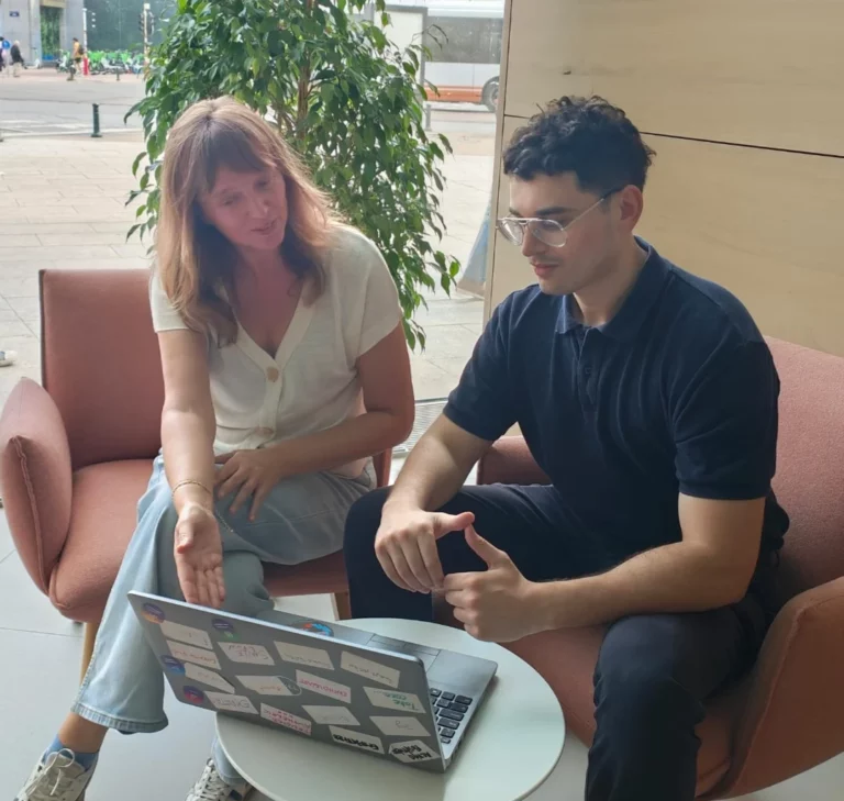
We followed Proximus’ agile methodology and organized regular ideation workshops and brainstorming sessions.
These collaborative moments helped validate user insights, align technical and legal requirements, and build a shared vision. They also played a key role in spreading a user-centered culture focused on inclusion.
I worked closely with Product Owners to define priorities, with Design System designers to ensure UI feasibility, and with legal teams to anticipate constraints.
Design & Solutions
Based on the insights gathered, I designed several improvement directions in close collaboration with the Product and Design System teams.
The core idea was to place accessibility at the heart of the user experience, from the very first interactions.
We reviewed key interface components to align them with WCAG and ETSI best practices: improved color contrast, increased minimum font sizes for TV interfaces, and visible focus indicators for remote control navigation.
Elements like carousels and content lists were adapted to be fully navigable without a mouse, with clear visual or vocal cues depending on user profiles.
Among the more structural proposals, I designed a dedicated Accessibility Menu that lets users filter content by accessibility features (subtitles, audio description, sign language).
I also introduced the concept of an accessibility profile set up during onboarding, allowing the platform to automatically adapt the interface to user preferences, such as enabling subtitles by default or increasing contrast levels.